

![Beatrice Hasell-McCosh, Hitzefrei, 2023 [detail]. © The Artist.](https://artlogic-res.cloudinary.com/w_2400,h_2400,c_limit,f_auto,fl_lossy,q_auto/ws-artlogicwebsite0172/usr/library/images/main/pages/40/img_5954.jpg)

Beatrice Hasell-McCosh in her studio, 2024. © The Artist.
My colours are very tonal and naturally lean towards the warmth of summer, cold feeling of winter (blues and cooler tones)... I do a lot of research around what plants are in each work too and what their inclusion might mean, for example, lots of the works have agapanthus in them (in Crinkle Crankle for instance) which is symbolic of love and health.
– Beatrice Hasell-McCosh, 2024
EASTWOOD FINE ART: You begin by working in watercolours from life, which culminate in these beautiful large-scale abstracted canvases that almost amount to environments, could you tell us about your process and approach to image making?
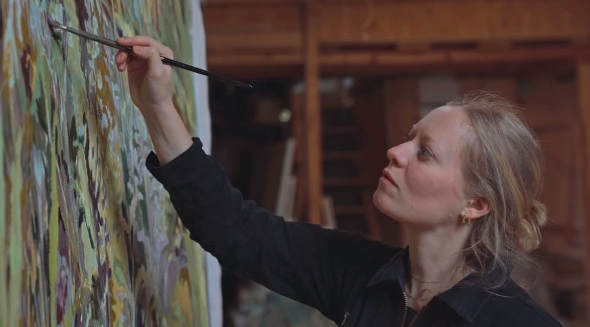
BEATRICE HASELL-MCCOSH: I spend a lot of time drawing to begin with. When the weather is good I try to make as much work as possible so that I then have these reference images for the rest of the year. Many of these small watercolours sit in my studio for a number of years, providing inspiration and architecture to the large-scale pieces over a long period of time. When I start a big painting back in my studio, I lay all the watercolours out on the floor and look at them continuously. I usually have a palette in my head to begin with but otherwise, it is all unplanned and as it comes together using shapes from the original drawings it becomes much more about the negative shapes, the liminal space and physicality of the paint itself rather than a figurative likeness. I work on 4 or 5 things at once and all my works inform each other over several months.
EFA: Hanging on the walls of your studio you have a small number of works by other artists, alongside numerous books. Do you draw on these as resources in your own work? And are there particular artists or creatives that you look to beyond nature itself for inspiration?
BH-M: Every time I sell my own work I put money aside to buy work by friends and people I admire – I have a Michael Armitage print that was part of an edition with all of the proceeds going to charities in Kenya providing aid to communities affected by the pandemic. I saw it in the RA Summer Exhibition but only managed to track down a print via White Cube as it had been so popular. I really think he is an Amazing artist and admire the way he shares his platform with other people. It's so nice to own work by friends that I’ve hung in the studio, and I look at them all the time including pieces by: Bobbye Fermie, Eleanor Watson, Flora Yukhnovich, Diarmuid Kelley, and Helen Beard.
Books are always such a great resource. I usually read a lot while having breakfast but when I begin a new work I also do reference them constantly, the ones I’m looking at most at the moment are about the history of wallpaper, a de Gournay catalogue from a while ago, Gwen John, Fragonard and a really great book about stained glass which has amazing illustrations.
Inspiration really comes from anywhere though, colours of historic adverts on brick walls, comic books, scraps of material or other people's paintings. I find it very energising to go to friends' exhibitions and see how they put their own work together, how they paint or choose to put marks down or compositional choices. People who I admire who are currently doing cool things include: Liorah Tchiprout, Tyga Helme, Casper White, Catherine Repko, Helen Beard, Anastasia Lopoukhine, Anna Woodward, Manon Steyaert, Cassi Namoda and Anne Carney Raines.
EFA: Many of your works emerge from studies made in the garden at your home in Cumbria, how does this connection to place inform your practice? And what draws you to plants and nature as a subject matter?
BH-M: I began drawing in the garden at home during lockdown. It was a form of dealing with the situation to begin with, as everything felt very uncertain, and drawing for me is a form of meditation. It’s also a space I’ve known so well for my whole life but suddenly viewed in a completely different, slower way. Spending time in the same places over a period of months and seeing things grow and then replaced as the seasons changed was very absorbing. The more I drew in the garden the more I wanted to transfer this experience onto a large-scale work that enveloped the viewer in the same way that being in the space did. The paintings are about trying to transfer this feeling of place.
EFA: In 2022, you presented a solo exhibition at The Garden Museum in London, could tell us more about this project and what’s next?
BH-M: The Garden Museum project was in the works for so long, I first discussed it in 2020 with the curators from The Violet Hour so when it finally came it was quite a pinch me moment. It was formed around the seasons and all the work was done during lockdown so it was also quite a good moment for putting all those thoughts into one place – and then also, because all the works sold, to clear out the cobwebs both physically and mentally and move onto the next project.
Now a couple of years later, I’ve begun to paint using a slightly looser and brighter language. The collection of work that I’m showing in my next solo show is quite different in feeling to the Garden Museum work. The show will open in the first week of July in London and is curated by Jenn Ellis at Apsara Studio who is someone I’ve admired for ages. I’ve been part of a number of her group shows over the past couple of years and her vision, creativity and diversity of programming is something I really respect about the way she puts together a presentation of work.
EFA: For SPOTLIGHT, you are showing two new canvases – Hitzefrei, 2023, and Crinkle Crankle, 2024 – could you tell us more about these and the significance of their titles?
BH-M: I come across ideas for titles all the time from all over the place. Hitzefrei is a German word for when it is too hot for schools and workplaces to function, and pupils and employees can take the day off. While painting this I was working in an absolutely freezing studio so a lot of the work is about armchair travel and imagination of what could be, particularly because I am working from drawings done mostly at the height of summer.
My colours are very tonal and naturally lean towards the warmth of summer, cold feeling of winter (blues and cooler tones), Autumn (lots of ochres and deep purples) or Spring (much greener and lighter). I do a lot of research around what plants are in each work too and what their inclusion might mean, for example, lots of the works have agapanthus in them (in Crinkle Crankle for instance) which is symbolic of love and health. I also have been doing an ongoing series of poisonous and medicinal plants (often the same but in different dosages). Many of the plants in Hitzefrei are common poisonous varieties, such as lily of the valley, foxglove and solanum. The use of the vivid and bright palette is also a reference to the often brightly coloured but highly poisonous plants which draw insects in with their colour.
Crinkle Crankle is named for the walls that protect plant and tree growth (originally fruit trees). It provides protection from wind and captures heat from the sun. It is interesting to note that the experience of the viewer is often widely different for different viewers, some being drawn to a work, its colours and marks and composition, that others will find uncomfortable.